
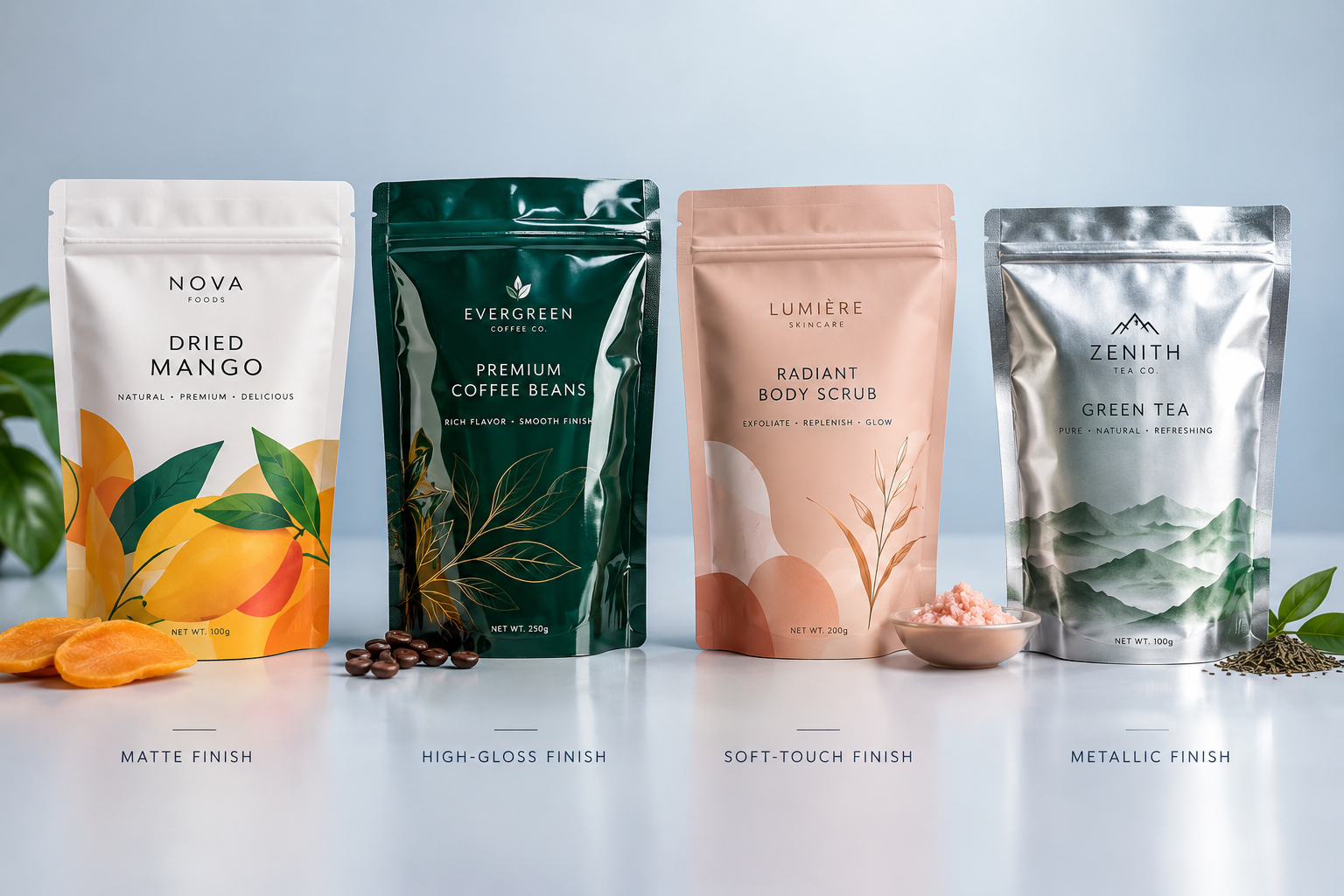
A printed Mylar bag can look completely different depending on how its surface is finished. The same artwork may feel understated on a matte pouch, brighter on a glossy one, or more premium when a few metallic details are added. Finishing is not just the last decorative step. It affects how people see the colors, read the label, handle the pouch, and experience the packaging in everyday use.
For brands developing Mylar bags, it makes sense to think about the finish while the artwork and pouch structure are still being planned. Waiting until everything else is approved can lead to awkward compromises. The best result comes when the printing, packaging materials, surface treatment, and practical needs of the product are considered together.
Start With the Look You Actually Want
Before comparing matte, gloss, or specialty finishes, decide what the package is supposed to feel like. A coffee pouch designed around muted colors may need a very different surface from a brightly illustrated candy bag. A premium product does not automatically need metallic foil, just as an energetic brand does not automatically need high gloss.
Think about where the pouch will be seen too. Store lighting, online product photography, handling, and the amount of text on the pack all change how a finish performs. This simple step keeps packaging finishing tied to a real design goal instead of turning it into a list of effects.
Matte Finishes Keep Things Subtle
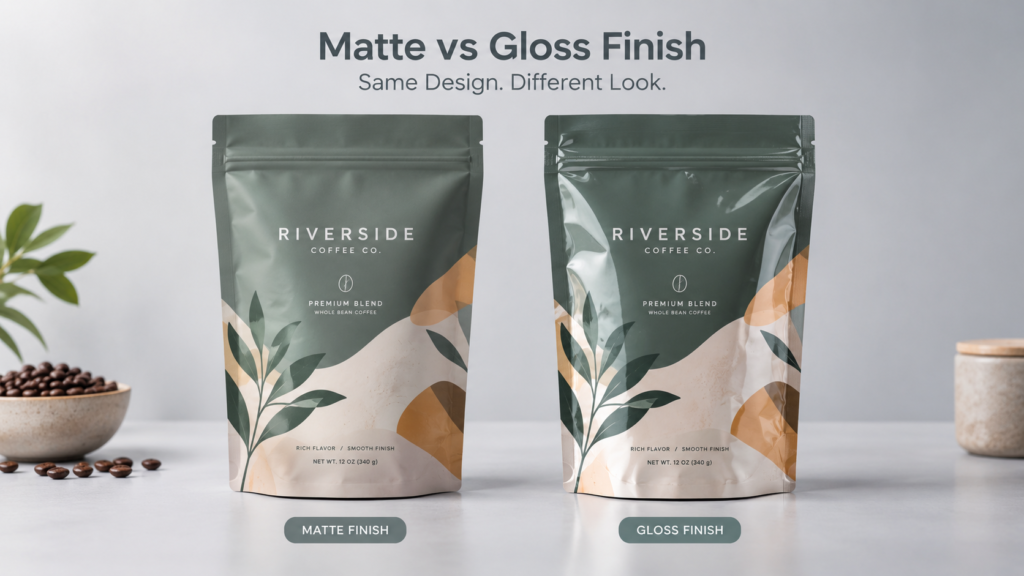
Matte is a popular choice when the design needs a softer, less reflective surface. It can work especially well with simple typography, earthy colors, minimal graphics, or packaging that is meant to feel calm and considered. Because the surface reflects less light, the artwork may also be easier to view under bright retail lighting.
There is a practical side to consider. Different matte films and coatings do not behave exactly alike. Some show rubbing, fingerprints, or scuffs more readily than others. If the pouch will be handled frequently, ask for a physical sample and test it rather than judging the finish from a digital mockup.
Gloss Brings Out Color and Contrast
Gloss goes in the opposite direction. It reflects more light and often makes bright colors, photography, and high-contrast graphics feel more vivid. That can suit snacks, sweets, pet treats, and other products that rely on strong shelf presence.
More shine is not always better, though. Reflections can make small copy harder to read, particularly on dark areas of the design. If the pack carries a lot of information, check a printed sample under the kind of lighting customers are likely to encounter.
You Can Use More Than One Finish
Some of the most effective printed packaging does not cover the entire pouch with one treatment. A mostly matte bag, for example, can use a glossy logo or pattern to create contrast when the light hits it. The effect draws attention without adding another color or making the artwork busier.
The trick is knowing when to stop. If the logo, product name, background, border, and illustrations all receive different effects, the package can start to feel overworked. Selective finishing is strongest when it gives the eye one clear place to land.
Soft-Touch Finishes Add a Physical Detail
A customer does not only see a pouch; they pick it up. Soft-touch finishes use that moment to make the packaging feel different in the hand. The surface can feel smoother and less conventional than standard glossy flexible packaging, which is one reason it is often considered for premium custom packaging.
Still, a pleasant texture has to survive real use. Filling, shipping, shelf handling, and repeated opening can be harder on a surface than a presentation sample suggests. Testing the actual material is particularly useful when the product may leave oils, dust, or residue on the pack.
Metallic Details Work Best With Restraint
Metallic effects can give logos, borders, patterns, or small design details a noticeable lift. Depending on the material and printing process, that look may be created through metallic film, ink, foil, or another production technique.
This is also where pouch shape matters. Die Cut Mylar Bags already stand apart because of their outline, so they may need fewer decorative effects to feel distinctive. A strong shape paired with one well-placed metallic or glossy detail can be more effective than covering the whole surface.
A Clear Window Can Do Some of the Selling
Not every inch of a printed pouch has to be covered with graphics. For products such as cookies, candy, nuts, or dried fruit, a clear window lets the product become part of the design. Customers can see color, texture, size, and quantity for themselves.
A window only makes sense when the product and barrier requirements allow it. Contents that are sensitive to light, for example, may need a different material structure. The visual idea should never come before the protection the product actually needs.
Printing and Finishing Have to Work Together
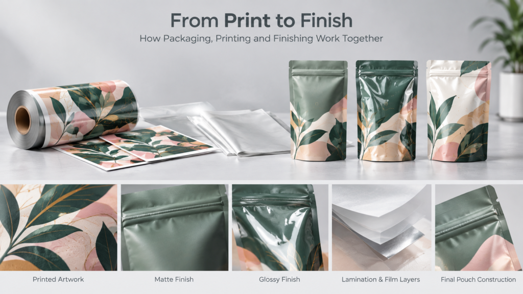
A finish cannot be chosen in isolation from the printing technique. Digital, flexographic, rotogravure, screen, UV, and other printing processes have different production considerations. Ink, film, lamination, curing, and the intended finish all need to be compatible.
Sealing is another reason to plan the surface treatment early. With Heat Seal Mylar Bags, the pouch still has to form a dependable seal after the graphics and finish are applied. Decorative treatments should not interfere with the areas or material behavior needed for sealing.
A Good Finish Cannot Fix the Wrong Pouch
It is easy to spend too much time discussing appearance and forget what the bag has to do. Printed packaging still needs suitable seals, barrier performance, puncture resistance, dimensions, and handling characteristics for the product inside.
Think through the full journey: filling, sealing, packing into cartons, shipping, storage, display, opening, and resealing. A finish that looks excellent on an empty sample may be less convincing after the pouch has been filled and moved through that process.
The same rule is especially important for safety-oriented formats such as Child Resistant Mylar Bags. Branding and surface finishing can still be part of the design, but a child-resistant claim should be tied to the relevant package configuration, testing, and requirements rather than appearance alone.
A Simple Checklist Before You Approve the Finish
Before sending a custom packaging design into production, look at the physical sample as a customer and as a production team. A short check can catch problems that are easy to miss on screen:
- Look at the pouch under bright and softer lighting. Is the important copy still easy to read?
- Handle it for a few minutes. Does the surface mark, scuff, or show fingerprints more than expected?
- Check the colors against the approved artwork. Does the finish make them look noticeably different?
- Fill the pouch if possible. Does the design still sit correctly once the bag has shape?
- Test the zipper and seal areas. Has any decorative treatment affected how the package works?
- Place it beside competing products. Does it look distinctive without feeling unnecessarily complicated?
This kind of hands-on review is more valuable than choosing a finish because it is currently popular. It shows whether the idea actually works on the finished package.
Let the Finish Support the Brand
There is no universal winner between matte, gloss, soft-touch, metallic, or selective finishing. Each one creates a different impression, and each makes more sense for some products than others.
The strongest printed Mylar bags usually feel deliberate rather than decorated for the sake of it. The surface treatment supports the artwork, the printing works with the material, and the package still performs the way it should. When those pieces line up, the finish becomes part of the brand experience instead of an effect added at the last minute.
FAQs
Which finish is best for printed Mylar bags?
There is no single best option. Matte works well for a softer, understated look, while gloss can make colors feel brighter. The right finish depends on the artwork, product, lighting, handling, and brand style.
Can matte and gloss be used on the same pouch?
Depending on the production method, selective effects may be used to create contrast between matte and glossy areas. This is often used to highlight a logo, pattern, or product name.
Does the finish affect heat sealing?
It can if inks, coatings, or decorative treatments interfere with seal areas or are incompatible with the pouch structure. Sealing requirements should be reviewed before the finish is approved.
Why is a physical sample important?
A sample lets you judge reflectivity, texture, color, scuffing, and handling in a way a digital proof cannot. It also gives you a chance to test the pouch after filling and sealing.